


Premium Printing Services Tailored for You
Welcome to Print City, your go-to print shop in Toronto for all your printing needs. Whether you need professional business cards, custom photo prints, or high-quality banners for your next event, we are here to deliver exceptional results. At Print City, we pride ourselves on offering reliable, efficient services with a focus on customer care and satisfaction.
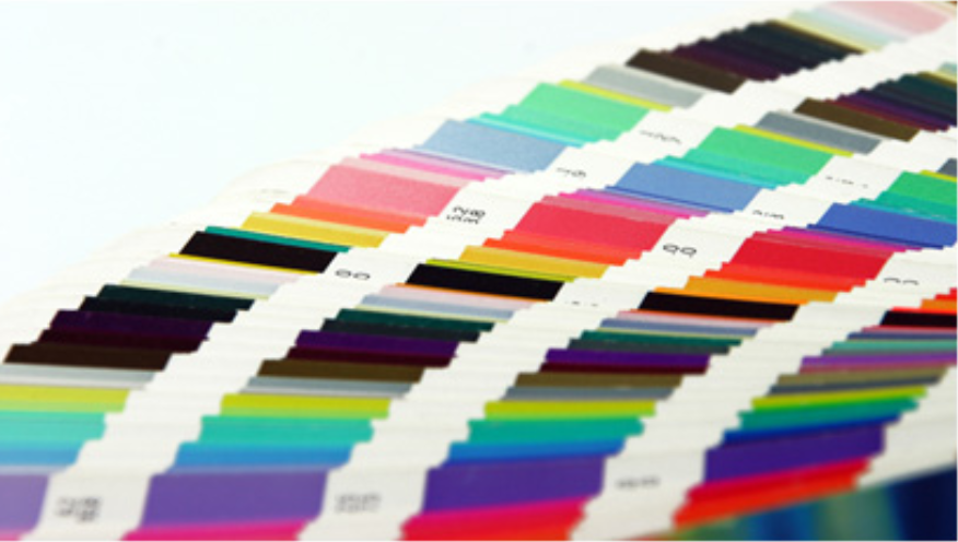
From business stationery to large format printing, we cater to a wide range of projects, ensuring your needs are met with precision and attention to detail. Trust us to bring your ideas to life with the highest level of service and care.
Submit Your Files Here!

We offer Rush SAME DAY SERVICE and Fast Turnaround for Large orders
About Us
At Print City, we’ve been proudly serving the Toronto community with top-notch printing services for over a decade. Our commitment to excellence has made us a trusted partner for businesses, institutions, and individuals alike. We understand the importance of delivering high-quality prints on time, which is why we’ve built a reputation for reliability, innovation, and attention to detail.
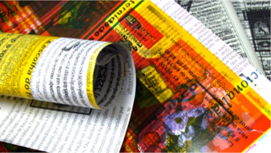
We are dedicated to offering competitive pricing without compromising the quality of our work. Whether you’re printing business materials or large custom projects, we provide the best value for your investment. Our focus on environmental sustainability ensures that we use eco-friendly printing practices and offer green options that align with your company’s values.
At Print City, we don’t just print—we build lasting relationships with our clients. Our personalized customer service and hands-on approach ensure that every project is handled with care and precision.